How the visual identity for the triennial was created
The visual identity of the 7th Tallinn Applied Art Triennial is created by Marje and Martin Eelma from the graphic design studio Tuumik. We asked them a few questions about how the triennial’s visuals were developed. And they also share a couple of their own favourites.
The visuals for the Tallinn Applied Art Triennial is really colourful and eye-catching. How did you arrive to that? Is there a story behind it? What were you inspired by?
We started off with the theme of the triennial, “Ajavahe. Time Difference”. When we got the initial brief, it featured a description of the Italian jewellery artist Giovanni Corvaja’ painstaking years long work “Golden Fleece” that seemed to defy all (contemporary) rational thinking – he is creating fur-like ritual objects of gold. The objects are made of gold wire with a diameter of 1/5 of a single stand of human hair and they feel soft as fur. This took our breath away and made us think how different the concept of time can be for people. The theme of the triennial also spoke to us, time is something we think about often. Images from our own past also started popping up: Marje studied in Tartu and had to go back and forth between Tallinn and Tartu, either by train or bus, so she always wondered about the many lit windows she passed in the complete darkness 90 km/h and the stories they could have told.
When we were creating the visual identity, we thought about the passing of time, how we perceive things differently, to what extent it is possible to go deeper when the tempo alternates – you notice bigger things when you move faster, details when you go slower. If the tempo is set for you by someone else and it is not what you are comfortable with, a certain shift occurs – you see your surroundings, but it seems different, your perception of reality is warped. Your own state of being changes how you see the world.
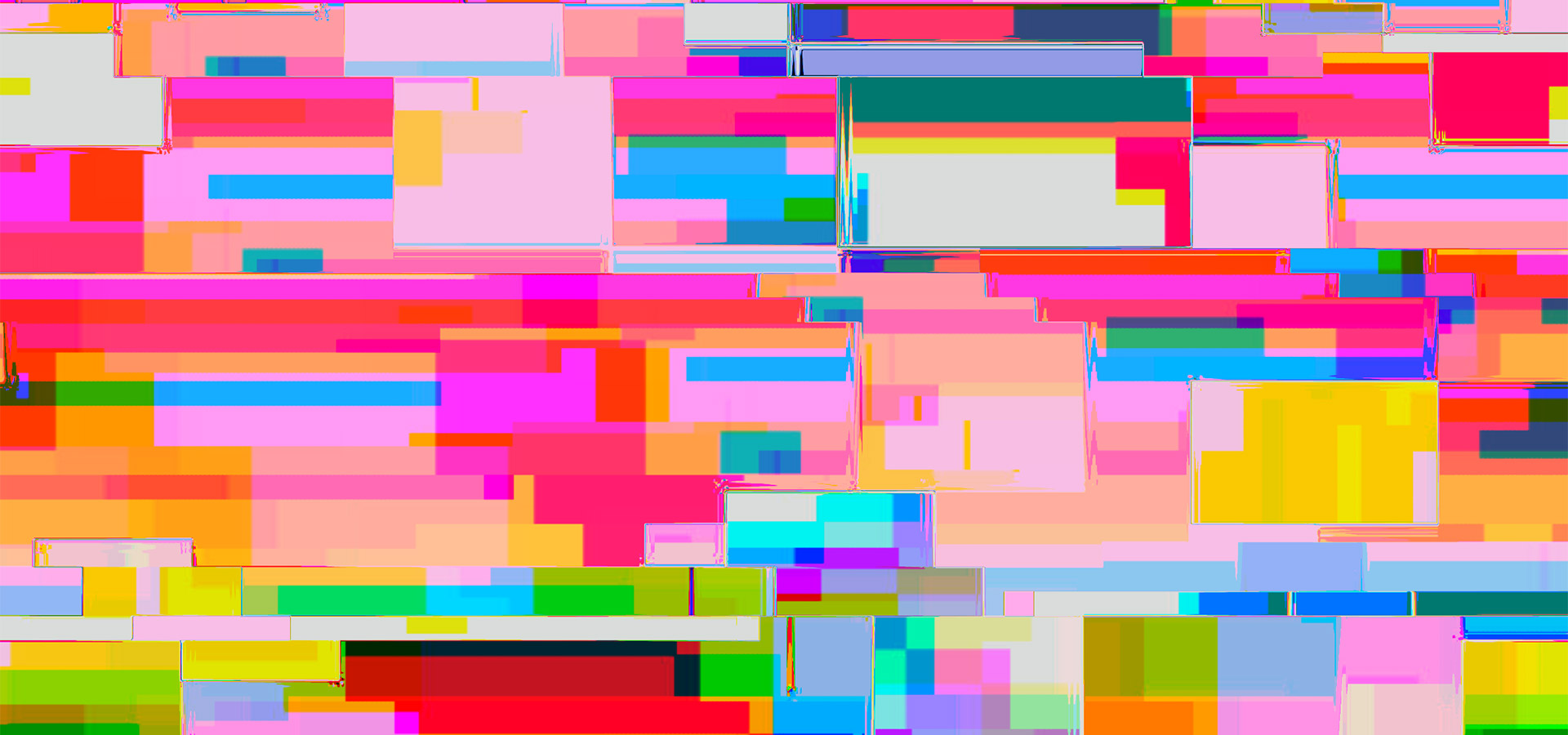
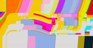
At first we were playing around with colourful surfaces, divided them into bigger and smaller sections, trying to convey different speeds with surfaces of different colour and size, according to the amount of information they displayed. Then we moved on to using a programme that worked in a way that you could shake, rotate or move around your tablet without even knowing what happens with the colours and shapes on the screen. The colours and shapes began shifting, the programme shook up reality and a whole other world appeared. We liked that it really related to the theme of pace, the passing of time.
Tuumik is a recognised graphic design studio, so you can surely choose your own clients. What inspired you to work with the triennial?
For us the number one concern is the people we work with, but also the project itself – is it necessary, does it have an idea behind it? It has to be consistent with our own view of the world. And the concept is also really important for us when creating the visuals. We also take on clients from outside the field of culture, although this field is particularly close to our hearts. It is important that we would find the work exciting.
We do not want to take on too many similar projects, it would not be interesting to us. We try to find projects that are new to us and we have not done art events like the triennial before. We were attracted to the fact that it is an international event. The participants seem fascinating and by working with them we can definitely get a more thorough picture than just by going to exhibitions. We love it when we get to know new things while working on something.